Trial and Error - The initial lookbook phase
*Clean images - unedited, just in their true form to seem more realistic and true to the actual garment.
*The use of some black and white photos - in order to break up the colour images within the books, perhaps where the text speaks more than the image? where it tells a story you cant see from the garment?
*Clean and crisp - both for the image and text layout, simple text is needed in order to be read and understood clearly by a reader, consider spacing between lines, try and include lots of white space, referring back to Pinterest page for idea's.
After our discussion, where we decided how we thought we'd like to move the design of the mini books forward in terms of layout, we then split the first mini book's content equally between the five of us, having to design and create pages for three of the garments given within the description of the interview Mila, the project leader, had given us.
The work was to be completed within a two week time frame, so as we could tweak any small layout details which we needed to when meeting again at the end of the two week period and that for the following week the layout of the first book would be done and complete and we could then move forward to use it as a template for the remaining seven books.
The three example double spread pages I designed for the first lookbook/mini book can be seen below, I created the below examples of pages for the mini book taking into consideration the points about the layout we had discussed, which are listed previously within this blogpost, whilst also using the groups joint Pinterest board for inspiration, which is available for you to view by following this link >>> https://www.pinterest.co.uk/kayleighlouisedavis/photobook-inspiration/
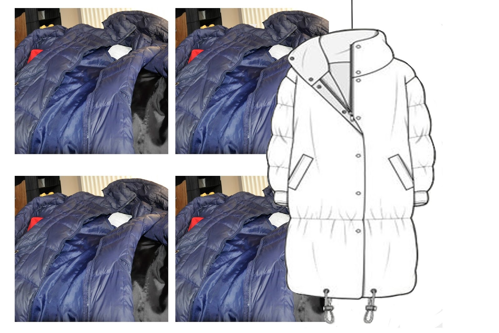
Page 1 -

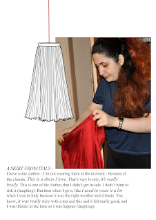
Page 2 -


Page 3 -
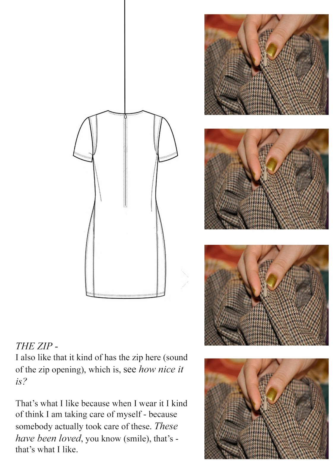

All three page designs, focus on a particular item within the women's wardrobe which she treasures or holds onto for whatever reason, whilst including lots of white space, letting the reader focus purely on the garment and its description, whilst my use of working drawings of the garments adds a more mechanical side, further development of these would pin point where parts of the garments are more worn than others, or where a button is missing etc. to match its description and give it a morn worn or overly loved feel.
At this stage, I am happy with my contribution to the group project in the form of the first few pages for mini book #1 and look forward to see what the other members of the group have come up with.
Jess xo
Comments
Post a Comment